How to Give a Great User Experience on Your Nonprofit Website, Guest Blog by SW Creatives

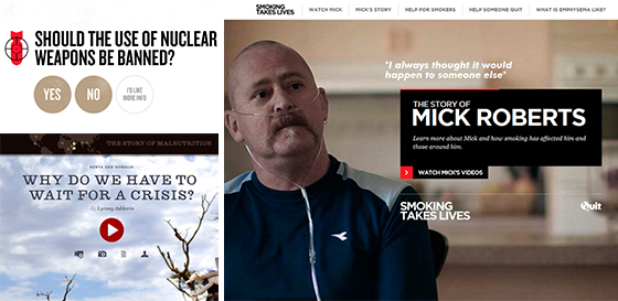
Smoking Takes Lives, Starved for Attention, and Target Nuclear Weapons are all fantastic examples of a great nonprofit user experience.
Guest Blog by Ryan Phillips, Design and Web Development, SW Creatives, Associate Members
Read the original blog here
In nonprofit web design circles, we spend a great deal of time and energy obsessing over the “user experience” visitors to your site can enjoy. Often, the sense of what makes a great user experience can be hard to put into words, even if the effect isn’t.
In other words, you tend to know a great website when you’re using one, even if you can’t say why. And conversely, if your nonprofit website doesn’t offer a great user experience, it isn’t going to be as effective as a recruiting, public relations, or fundraising tool as it could be.
So, how do you give users a great experience on your nonprofit website? Here are some details to pay attention to:
YOUR NONPROFIT WEBSITE LOADING TIME.
No one likes to sit around waiting for a website to load. And, even if users stay, their attention might be divided by the time your pages come up. Have your nonprofit web design team optimize graphics, text, and other elements to show up quickly for visitors.
COMPATIBILITY ACROSS BROWSERS AND DEVICES
Given that nearly half of all of today’s Internet traffic comes from mobile devices like smartphones and tablets, there isn’t any excuse for having a nonprofit website that doesn’t function correctly with these platforms.
THE AESTHETICS OF YOUR ONLINE WEB PRESENCE
Although we always like to point out that the look of a nonprofit website isn’t the only thing that matters, you can’t deny that a beautiful layout makes a strong impression – and is an important part of your visitor’s user experience.
THE USABILITY OF YOUR NONPROFIT WEBSITE
As we’ve pointed out in recent blog posts and newsletter articles, usability is more than a web design buzzword. If you make it simple for visitors to find what they’re looking for on your site, it’s likely to make a better impression (and for the visitor to return again in the future).
When you give visitors to your nonprofit website a great user experience, you subtly invite them back to experience your site again and again. Regardless of what your online marketing or communications goals are, having visitors engage with your site more easily is going to be a good thing.
Need help building a strong nonprofit web presence? Call SW Creatives today and let them give you a free consultation.
Connect with Maryland Nonprofits on Facebook, Twitter, LinkedIn, and Google+, tell us what you think and what kind of topics you would like to see more of on our blog.
![]() Find the perfect nonprofit career this summer, follow @MDNonprofitJobs
Find the perfect nonprofit career this summer, follow @MDNonprofitJobs
