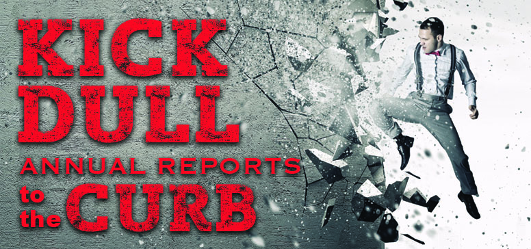
Kick Dull, Boring Annual Reports To The Curb
Guest Blog by Alizah Epstein, Chief Creative Officer, Epstein Creative Group

THE END OF THE YEAR IS FAST APPROACHING, and if you’re like some fellow nonprofits, you may be scrambling around to compile that dreaded annual report. But before you start to panic, calm down and breathe!
When it comes to drafting annual reports, trends are changing for nonprofits—and for the better. Luckily, nonprofits are not held to the same requirements as corporations. As a result, more nonprofits are taking advantage of the opportunity to be more creative and efficient with their annual reports.
For nonprofits, annual reports can be used as an effective call to action piece or a “thank you” piece to donors. It doesn’t have to be super wordy or filled with endless pie charts or graphs. It is also not an opportunity to list the name of every single donor. This takes up the already limited space you have to work with, and it also increases printing costs. The annual reports of today are much shorter and image heavy. Here’s why:
- Visuals are processed 60,000X faster in the brain than text. (Source: 3M Corporation)
- 40% of people respond better to visual information than plain text. (Source: Zabisco)
- Currently, the average attention span is 8.25 seconds—that’s less than a goldfish! (Source: Statistic Brain)
Your Options
According to a report by Deloitte, the average length of traditional annual reports are still around 132 pages long. Given the stats mentioned above, we doubt these reports are being fully read. Therefore, long reports should be avoided like the plague. So how “short” should your nonprofit’s annual report be? Luckily, there are quite a few creative options.
1. Newsletter format (4 pages max) –This is a good option if this is your first time going short. To view an example, click here.
2. Trifold (2 pager) – This can include a short letter, maybe an infograph, donor-centered testimonials and “in brief by the numbers.” To view an example, click here.
3. Infographic – There are several styles that would work for an annual report, and they really do a great job of getting right to the point in showing impact. Just remember to keep the language donor centric. To view an example, click here.
4. Postcard – This is really short sweet and to the point but just as effective. To view an example, click here.
5. Video – This is another option. (To view an example, click here.) It can make a very nice personal thank you. Some tips for a good video include:
- Have a song playing in the background that matches your message
- You can use still shots or action shorts and the visuals should change with the beat of the music.
- The audio should be off and we should just hear the music and/or the narration.
- Keep it under 2 minutes
- You can also narrate it – think 200 words
- You can use multiple narrators
- Keep it upbeat
- Focus on what you hear and see. It should work with the sound off
- Focus on accomplishments
Alizah Epstein is the Chief Creative Officer at the Epstein Creative Group. As a passionate creative thinker and problem-solver, she is the driving force behind the branding and marketing design studio. What makes this firm different, is that they focus on branding and marketing for mission-driven organizations that benefit women and children. Through strategic branding and marketing efforts, they secure more donors and build awareness so these organizations can continue the good work that they do. To learn more visit epsteincreative.com. Design with purpose.
