 Blog invitado de Sarah McCruden, Technology and Information Specialist, Carson Research Consulting, Inc.Miembro asociado de Maryland Nonprofits
Join Carson Research Consulting November 5th at our Annual Conference “Connecting for Impact!” for a Roundtable Lunch Discussion about nonprofit evaluations!
Many nonprofit organizations rely on in-house staff members to crunch numbers and create reports for their program data. This means that, in some cases, those who are inexperienced at turning heaps of data into charts and graphs will find themselves stuck with a daunting task: creating meaningful data visualizations for their program.
Now, there are a few basic tenets of data visualization to which everyone should adhere. For example, all pieces of a pie chart need to add up to 100%. But let’s say you know the basics already. What else might you want to keep in mind when choosing a visualization for your data?
My top suggestion: Your knowledge of your program and the populations you serve can make all the difference when it comes to presenting your results. So, if you think your data visualizations are not showcasing your program results in the way you expected, try to determine why they might look this way.
There’s more than one way to visualize data
Let’s look at a fictional program as an example, say I am reporting on outcomes in a program serving adults struggling with addiction. I want to show that clients who participate in this program are not only more likely to start drug & alcohol treatment, but also successfully complete the treatment program as prescribed than those in a control group of equal size (who did not participate in the program).
When I look at the results, however, I am disheartened. It appears as though there is very little difference between the two groups in terms of who is more likely to complete treatment:
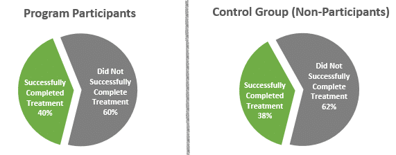
Yet anecdotal evidence from my fictional program (talking to program participants and non-participants, etc.), tells me that those in the program do indeed seem more likely to overcome their addictions, stay in treatment, and stay clean. So what went wrong?
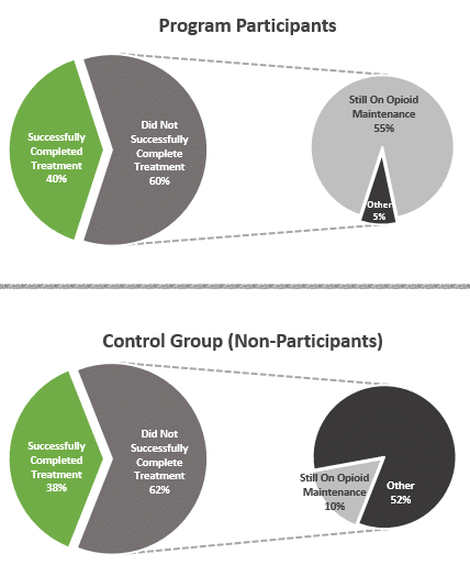
Well here’s something I had not considered, what if most of the addicts in both groups cited heroin as their drug of choice. In this case, their prescribed drug treatment would likely be an opioid maintenance program, i.e. methadone maintenance therapy (MMT), as this is commonly used in the treatment of opioid dependence. MMT is a treatment that can go on for years, in some cases. So the individuals on MMT would not technically be considered to have “Successfully Completed Treatment,” since they are not yet finished with treatment, but many have abstained from drug use for the entire time and have reformed their lives such that had they not been on MMT, they would be considered “Successfully Completed.”
To remedy this, I use the same pie charts—but this time, I give a breakdown of the portion of clients that did not successfully complete treatment to show those who are still in MMT:
This visualization shows that while the percentage that technically completed treatment is almost the same for the two groups, a large portion of program participants who did not complete treatment are still on Opioid Maintenance. In the non-participant group, the vast majority of those who did not complete treatment had “other” reasons for this (like dropping out of treatment early). This gives a completely different perspective on the same data, and shows just how powerful your choice of visualization can be. While both examples are accurate representations of the data, one is simply more effective at showing the program results.
So remember, you know your program better than anyone else does. Use that knowledge to choose a visual representation that shows the world what your program has achieved!
About Sarah: Sarah McCruden, the Technology and Information Specialist for Carson Research Consulting, Inc., turns client’s evaluative data into informative and compelling graphs and charts. Carson Research Consulting offers a range of services in research and program evaluation.
![]() Únete a Conferencia anual 2014 de organizaciones sin ánimo de lucro de Maryland "¡Conectando para impactar!" 5 de noviembre en las Universidades de Shady Grove en Rockville, MD.
Únete a Conferencia anual 2014 de organizaciones sin ánimo de lucro de Maryland "¡Conectando para impactar!" 5 de noviembre en las Universidades de Shady Grove en Rockville, MD.
Conéctate con Maryland Nonprofits en Facebook, Twitter, LinkedIn y Google+, dinos lo que piensas y qué tipo de temas te gustaría ver más en nuestro blog.
![]() Emprenda una gratificante carrera profesional sin ánimo de lucro, siga @MDNonprofitJobs
Emprenda una gratificante carrera profesional sin ánimo de lucro, siga @MDNonprofitJobs